Dhat Creole Grill & Beignet Spot
2021-22 rebrand
I had the opportunity to supply the new logo, artwork, and mascot characters behind the best Caribbean restaurant in Riverside.
Art Direction, Graphic Design, Character Design

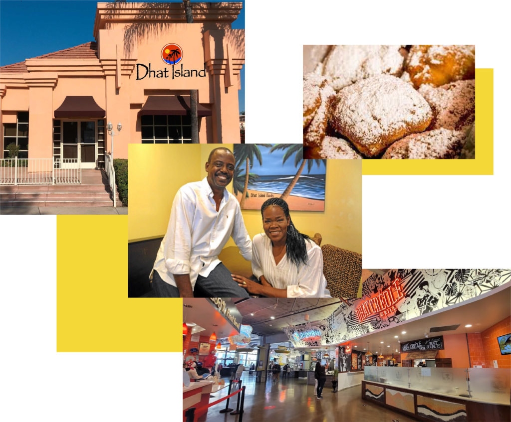
After successfully opening Dhat Island (a highly-rated Creole restaurant in Redlands, CA serving life-changing dishes) and prosperously feeding the Redlands community for almost 10 years, owners Carlo & Angela Alce saw immense value in the food they prepared and were ready to expand their business to new locations with a new business model.
By early 2020 they were ready to open a new venture, Dhat Creole Grill in Riverside, CA. With this restaurant adopting the fast-casual model, different from the original’s dine-in style, the Alce’s also felt a visual rebrand was necessary to math the change. Furthermore, Carlo & Angela also had a small shop selling their fan-favorite beignets, Speignet Spot, set to open in 2022. This brand new spot needed an original logo, branding, and mascot to grow as its own identity.

Brought on as art director for this project, I first had several great conversations with Fabrice Alce, the director of operations at Dhat Creole Grill, to really nail down the essence of what the Alce’s desired to hang on their new restaurant walls.
Fabrice wanted the art to highlight the life and vibrance found in their food. “Every piece should have motion – I want to blend Dhat Creole’s food into pop culture history, incorporating a mixed array of street art and pop art styles” he noted. This aligned with what Carlo and Angela liked about my previous work (seen on the top left) – it seemed I would be a good fit for the job! Thus, I got to work.
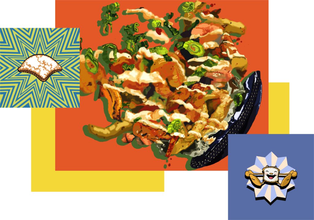
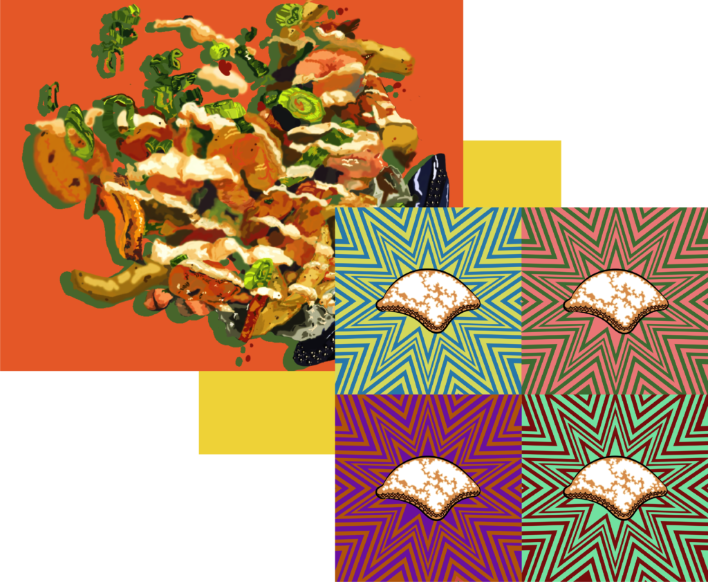
You can see some of my early sketches and concepts to the right; the American Gothica and Simpsons parodies were scratched in favor of the more original and product-oriented pop art beignet and distorted jambalaya.
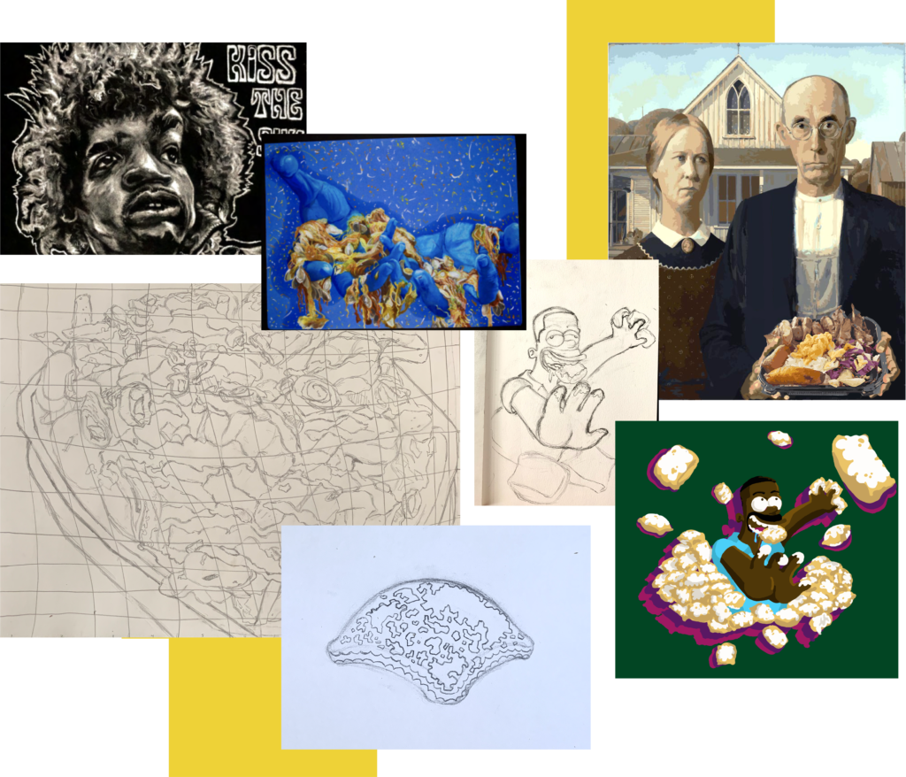
With the greenlight to move forth with the jambalaya and beignet pieces, I proceeded to paint using Photoshop ad Illustrator. For the jambalaya portrait, I hand drew a distorted grid of a regular plate. Next, I drew in a new plate to the side. Getting rid of the original. With the perspective distortion and the newly positioned plate, it was my intention to add even more energy to the ingredients flying off the canvas.
The pop-art beignets were inspired partly by the stylized geometric compositions of the Art Deco period, the saturated colors of Takashi Murakami, and the repetitive nature of Warhol. I brought these elements together to make Dhat Creole Grill’s signature beignet a powerful delicacy that packs transcendent flavor.
There are now two prints of each piece hanging on Dhat Creole Grill’s cashier-facing wall – all on 2’x4’ canvases.

My initial approach towards the Beignet Spot logo was to keep a simple sans-serif font, staying true to the modern theme I believed the brand wanted to go for. Early iterations can be seen to the side.
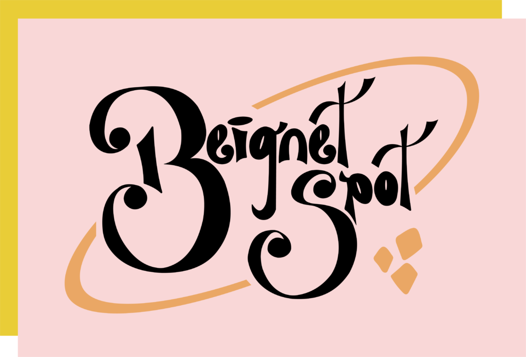
These early versions, however, didn’t capture enough of the warmth and inviting home-like atmosphere that Dhat Island was previously known for and intended to keep in this new business. That’s when we decided to make a shift to the looser, more script-like type (shown at the bottom) embodying more of a Krispy Kreme delights look and feel.
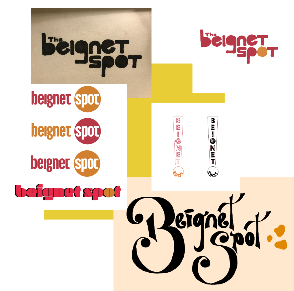
I passed quite a few tweaked logos back and forth with Carlo Alce over the course of a couple weeks. He felt there needed to be an additional component to frame the logo; I also felt this was important so the piece could be scalable and remain recognizable. I added the ring and the mini trail of abstract beignet desserts in order to give the letter mark a minimal yet iconic touch.
Beignet Spot is currently in construction in Riverside, CA, and is scheduled to open by the end of 2022! This project was really exciting to work on and I appreciate the Alce’s so much for entrusting their restaurant logo with me. I hope when customers see the name on the packaging, website, and storefront they are connected to the beautiful, cozy, and ultimately delicious spirit that these beignets bring to the world.
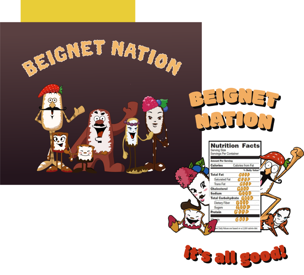
My third collaboration with the Alce’s dealt with bringing a dream of both of our’s to life: the creation of a company mascot.
It turns out, not only was I commissioned to design one loveable character, but an entire family of Beignet Spot personalities. My first sketch on the top right championed my favorite features from chibi characters and 1920’s Disney animations. I originally brought forth the option of a mother, father, and child beignet but Carlo Alce wanted even more. “I want to make a diverse beignet nation!” he commented.
Therefore, more experimentation ensued..
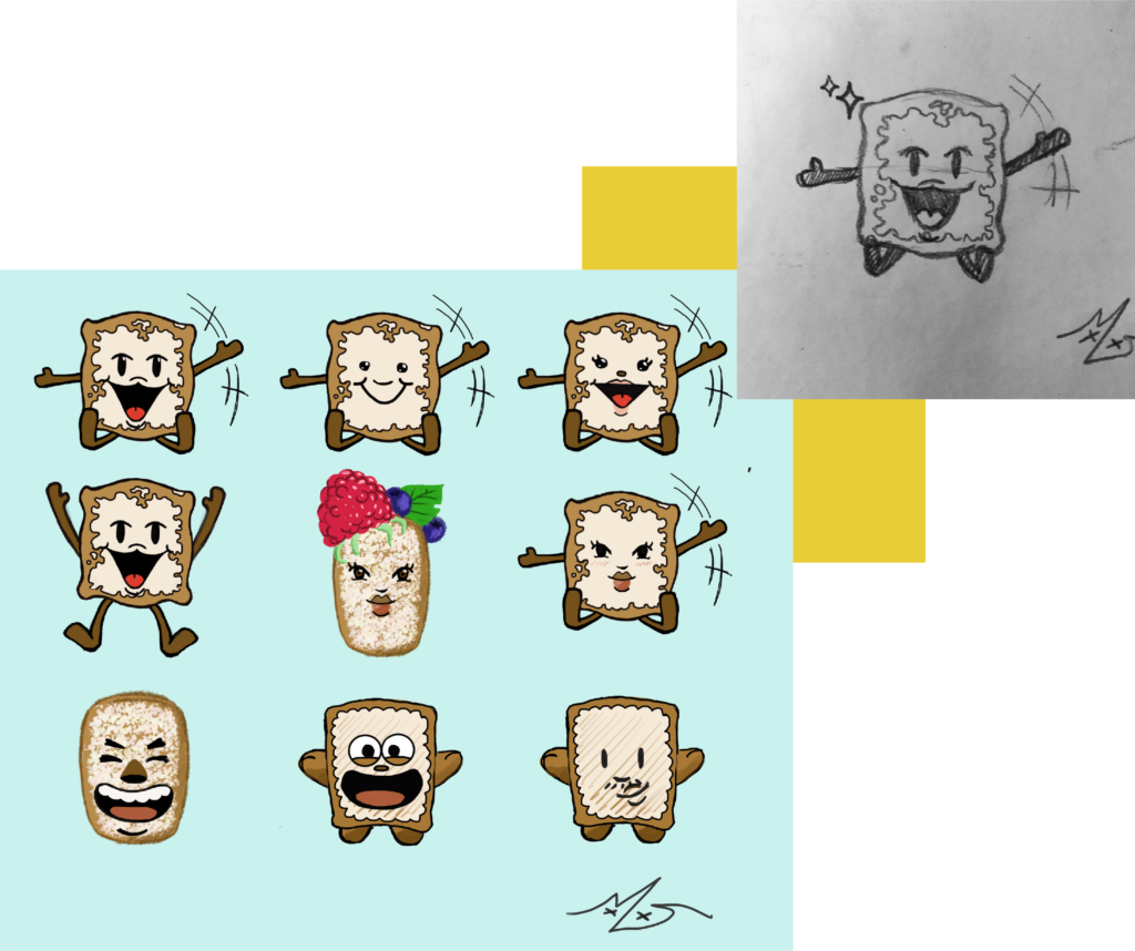
To be honest it was quite the challenge designing anamorphic beignets that each have diverse features but simultaneously don’t come across as offensive. I tried and tried again mixing the right amouth of skin tones, ages, and subtle face structures – and these six were the result! Meet Archie, Pratika, Friday, Baker, Sandy, and Mama (name order is from left to right).
The Alce’s appreciated that I honored their requests and vision in what to include. My favorite part of the process was creatively depicting toppings as accessories 🙂
It is out goal to include this colorful cast in murals, menus, and merchandise going forward with Beignet Spot’s brand. This is only the beginning of many more Alce collaborations to come. Here’s to the bright future of Beignet Spot!
Painkillerz Podcast Logo
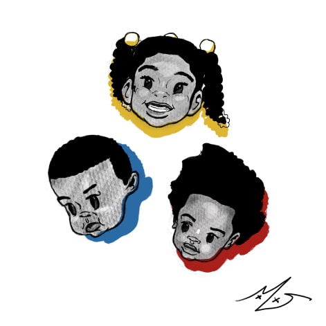
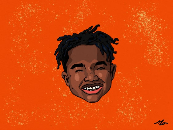
I designed the logo and mascot characters, cartoon versions of hosts Daryll Evans and Brett Hinton, for their upcoming podcast “Painkillerz”. I wanted the heads to tell a story before a potential listener clicks on an episode and let them know through visuals that they’ll be in for a good time.
Art Director
Mya Davis, Eliza Glover, Kia McCormick
Haute x Mya Davis Merch Collaboration
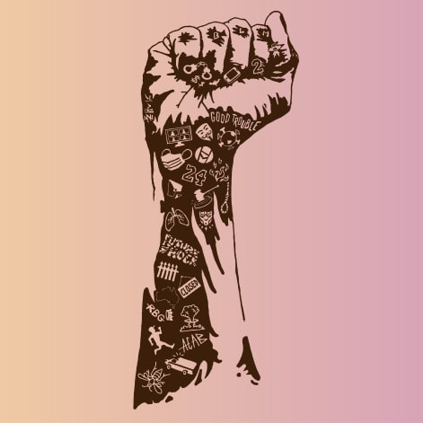
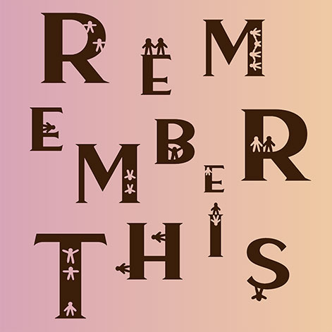
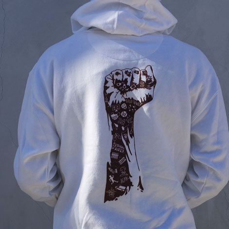
USC’s art, fashion, and culture collective, Haute magazine, partnered with yours truly to release a limited hoodie run alongside the launch of their Fall 2020 issue. They were looking for a black creator with a unique style to highlight their semester theme, “Remember This”, which was a call to action for viewers to genuinely internalize what the globe had been through that year. I was motivated to illustrate a memorial of moments in 2020 that would change us forever, but in my cartooning style. The project was a tremendous learning experience and I loved the contrast in how such simple illustration could pack so much meaning.
Creative Director, Art Director
Mya Davis
In the AM with PM logo
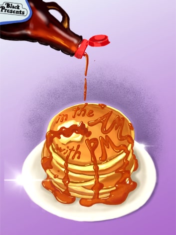
The summer of 2021, I designed the logo and flyer for USC radio hosts Pilar Lee and Marlize Duncan. Going for a soft airbrushed scene, I listened to Pilar and Marlize’s requests to fashion the logo after Y2K aesthetics and color palettes. This graphic is now used towards their social media branding (Instagram, Tik Tok) and is thrown up all over their showroom during episodes.
Art Director
Mya Davis
Evans Family Portrait
I was commissioned by an old friend, Daryll Evans, to paint a portrait of himself, his older sister Maya, and his cousin Ryan (the latter two are now deceased). Honoring his request to memorialize his family with a light cartoon style, I produced some of my favorite character work to date. Other relatives of the Evans family were thankful for the emotion I captured and immortalized and it was an honor to be of service contributing this gift.
Art Director
Mya Davis
USC Web Dev. 2 Final
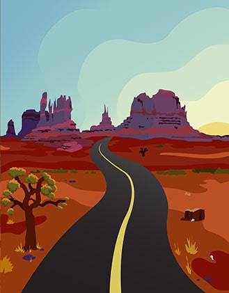
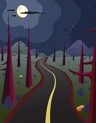
For the final group project in my development class we were tasked with coding a travel website using mysql and php. I wanted to design a parallax background inspired by https://www.firewatchgame.com/ and advertise the beauty of a handful of renowned California landmarks. It was a blast crafting these scenes in almost a paper-art 2D style. I enjoyed the process of sketching then limiting myself by working solely with two tools in Illustrator.
Art Director
Mya Davis, Eliza Glover, Kia McCormick
Hollomon Family Portrait
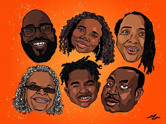
I was commissioned by an old friend, Taylar Hollomon, to draw a caricature of her family as a Christmas gift. It was super fun crafting this style with minimal toon-shading
Creative Director, Art Director
Mya Davis
Black Out the Ballot x Melrose Trading Post Flyer
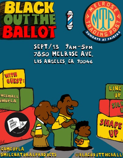
I helped nonprofit organization, Black Out the Ballot, advertise their presence at Melrose Trading Post offering free haircuts with voter registration. I modeled the characters and scene after the Schoolhouse Rock aesthetic BOTB embeds in their branding and produced a genuine and warm invitation.
Creative Director, Art Director
Mya Davis
Distorted Self Portrait
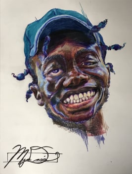
For a solo project I wanted to exercise myself and draw a self portrait using colored pencils. Rather than producing a portrait that was 100% accurate, I was more interested in opting to distort features and employ a frenzy of near psychedelic colors. The intent is not to resemble a druggy filter but rather to symbolize the natural auras and emotions I cannot control.
Art Director
Mya Davis
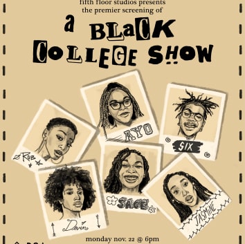
A Black College Show Premier Flyer
I designed the flyer promoting the launch of a passion project helmed by my dear friends and USC Drama students Wynton Jones, Dara Adedara, and Kennedy Hill. Their webshow revolves around six black college students and their adventures, conflicts, and growth at a PWI. Wynton & Dara really enjoyed my previous portrait work so I drew stylized snapshots of the main characters to drive intrigue towards the best element of this series, its cast. The promotion led to a packed lecture hall the night of the release!
Art Director
Mya Davis
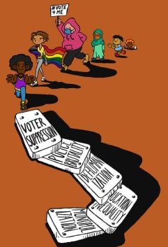
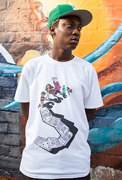
Black Out the Ballot x Crenshaw Skate Club Collection
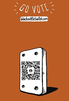
In fall 2020, I had the opportunity to mentor a high school activist from North Carolina and collaborate on designing a t-shirt that promoted the importance of active voting. I took my mentee’s concepts and turned them into a streetwear graphic reminiscent of Crenshaw Skate Club’s style (the brand launching the shirt). #vote4me is a national movement fueled by youth who want to see change and therefore encourage those of voting age to get involved. We listed a qr code on the back of our shirt that linked anyone curious to a custom voter registration site. It was amazing to see a creative project like this generate measurable impact.
Art Director
Mya Davis, Miliani Smith
Luv Leek Cover Art
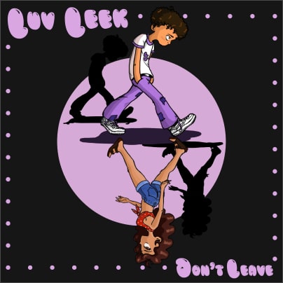
In combination with the visualizer (found in the Animation gallery), I designed the cover art for rapper Luv Leek’s single, “Don’t Leave”. This project gave me an opportunity to stretch my character design skills and pull inspiration from anime inspired by artists like @yalocaloffgod. I was enthusiastic throughout the entire process from sketching the wardrobe to picking out a color palette for a branded rollout. Thank you Malik, it was an honor to produce this for you!
Creative Director, Art Director
Mya Davis
AP Art & Design Breadth Piece
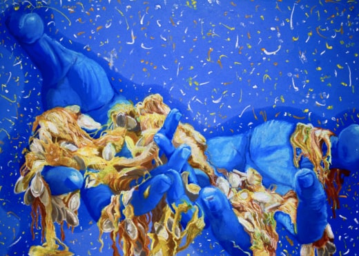
Working with pastels, oil, and q-tips, I illustrated this 27”x22” piece exhibiting chaos in fine detail. Playing off the idiom of “spilling your guts” I thought it would be a fun image to paint human hands offering a mound of pumpkin insides. This blend of realism and surrealism was real treat to work on and a testament to what I enjoy cooking up on my own. Weird stuff.
Artist
Mya Davis
Verkoshansky Logo
For 40 years, Verkoshasky has committed to spreading an elite Russian Olympic training regiment to athletes across U.S. universities. Now in 2022, Verkoshansky needed a modernized logo to appeal to a new generation of athletes. I collaborated alongside their creative team to design a clean lettermark that includes their initials and an abstractified Olympic torch + athlete figure inside.
Logo Artist
Mya Davis