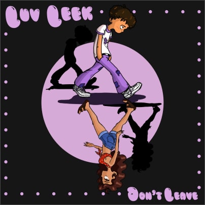
Sumit (Branding and Promotional Work)
brand:
Sumit (rapper, singer, producer)
project:
Sumit (Branding and Promotional Work 2019-21)
summary:
Chronicles of my three-year+ collaboration with the incomparable personality and exceptional musician, Sumit, in which I craft his signature brand and produce several visuals, helping grow his following substantially and organically.
responsibilities:
Art Direction, Graphic Design, Creative Direction


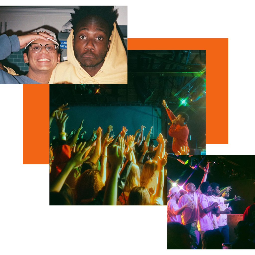
two friends,
two dreams
Coming from a large math and engineering background, Sumit wanted to use the connections and resources he’d gain at USC – not to deepen his engineering expertise, but to alternatively and almost unexpectedly cultivate and pursue his dream of launching a music career.
We immediately bonded over our love for music and the creative arts; I explained I wanted to gain as much experience in branding and art direction as possible during my time at college. He was starting out as a Spotify artist with one single and 200 monthly listeners. We both gave each other a shot professionally and I will forever be thankful and in awe of the work and relationship that blossomed from that point on.

Moshpit
Me and Sumit’s first project together was a beserk rap track that I was coincidentally featured on! Our dear friend and producer Simon Cantor played us an intense industrial beat we just couldn’t ignore.
After having ridiculous fun freestyling and writing hooks, Suit decided he wanted this song to be the debut single for a new era of his… a commitment to commencing this music career. And he commissioned me to craft the cover art.
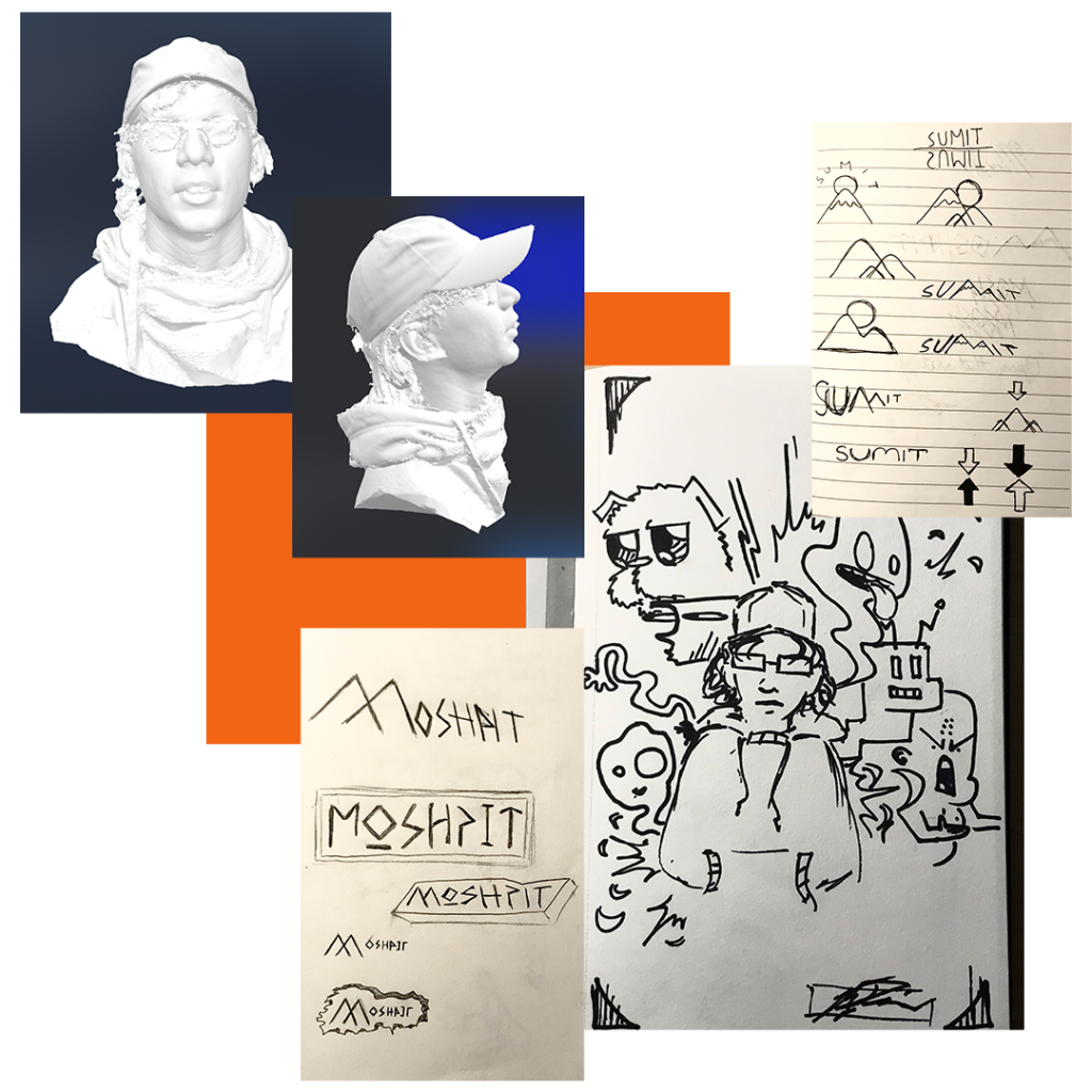
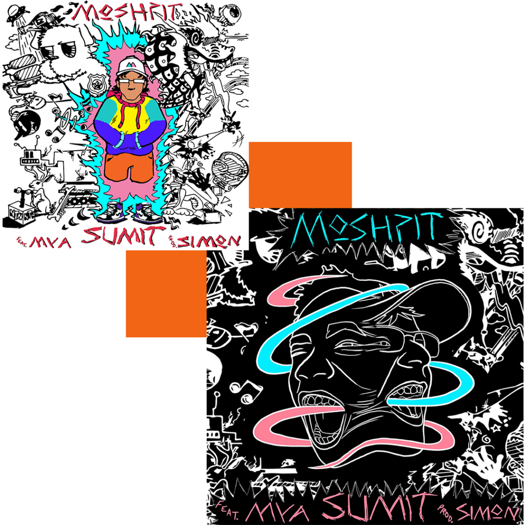
We both desired a cover that could accurately portray the animosity and just plain fun we exhibited when making the track. I, therefore, thought of tons of methods to create such an atmosphere. I shot a 3D render of Sumit’s head that I could potentially rip apart. I played around with ripped paper and texture effects. Ultimately, we scrapped these ideas in favor of something I knew best and a style Sumit really enjoyed – my fictional doodles.
Pictured right you can see the early concept sketches for a logo and cover.

evolution
One thing I’ll always love about working with Sunit is his persistence to not stop until the vision is perfected. Going for a Murakami, Hannah-Barbara-inspired collage, we were very deliberate on what images, colors, and line weights to embed.
The first “final draft” can be seen on the top left. Sumit eventually wanted to replace his cartoon portrait with a line-art portrayal of the both of us. We also felt that by inverting the black and white, we could bring out the grimy chaos we were looking for.
On the bottom right we have the full final draft. Designer Andrea Gomez drew the face-mesh and I crafted the typeface. We kept all assets to animated (and 3D print tokens) down the road. Looking back to this 2019 project I think the information architecture could’ve been arranged a little better but overall it was a great start. It felt overwhelmingly cool to have my work actually featured on a streamable song. This project definitely fueled us to keep going.

i think we can
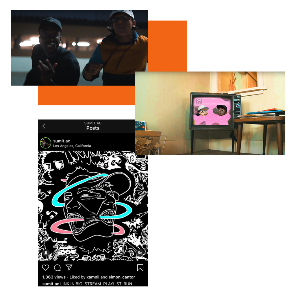
Following Moshpit’s release and positive initial reception from family and friends, Sumit and I brought in directors Joel Yoon and Max Lin to film a whirlwind of a music video. It felt great having a friend group that self-initiated opportunities for expression and growth. We made what we wanted!
Moshpit now has over 67,000 plays o Spotify alone. Like I said before, this was fuel for us because now we understood that other consumers also enjoy what we enjoy! So we kept the ball rolling.

CHOLULA
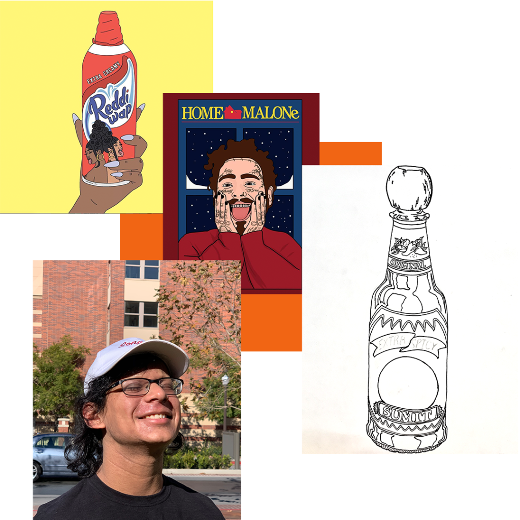
After Moshpit’s release November 22, 2019, it wasn’t long before Sumit and I began to talk about what we wanted to curate for his next song. This ideation process actually came fairly rapidly this time around. Sumit knew he wanted the song name to be ‘Cholula’ and we’d both become heavily inspired by clean and punny graphics works by Instagram artists like @chloelanger and @somehoodlum (seen on the top left).
I pitched the idea of slapping Sumit’s charming face on a literal hot sauce bottle and we both cracked up at the idea immediately. It was time to go to work.
You can view a scanned sketch of the bottle and the reference picture I used for Sumit to the left.

ESTABLISHING CONTINUITY
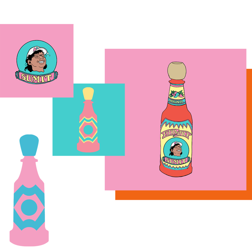
Though I still made tons of tiny alterations to the artwork, this was the clearest vision the both of us had on a project together. We just loved how happy everything looked (finished product far right). The colors we chose to be the main elements played a huge role in evoking that feeling. These colors also brought up a great question Sumit and I wanted to think about when envisioning his career long-term: how should Sumit market himself? What’s his brand visually? What hex values, textures, and art styles are going to sum up this debut era?
The art direction for Cholula was so integral to the timeline because that’s when we nailed Sumit’s theme of vibrance and colorful aura. Just by aligning his music with bubblegum pinks, sky blues, and creamy violets we could paint a picture that appealed to all the senses.
In addition to the full cover, we created other, more simplified assets that Sumit could use as profile pictures, website headers, and even sweatshirt designs (see bottles and simplified frame to the right). This was the foresight we began to apply and mature for Sumit and his brand.

gelato
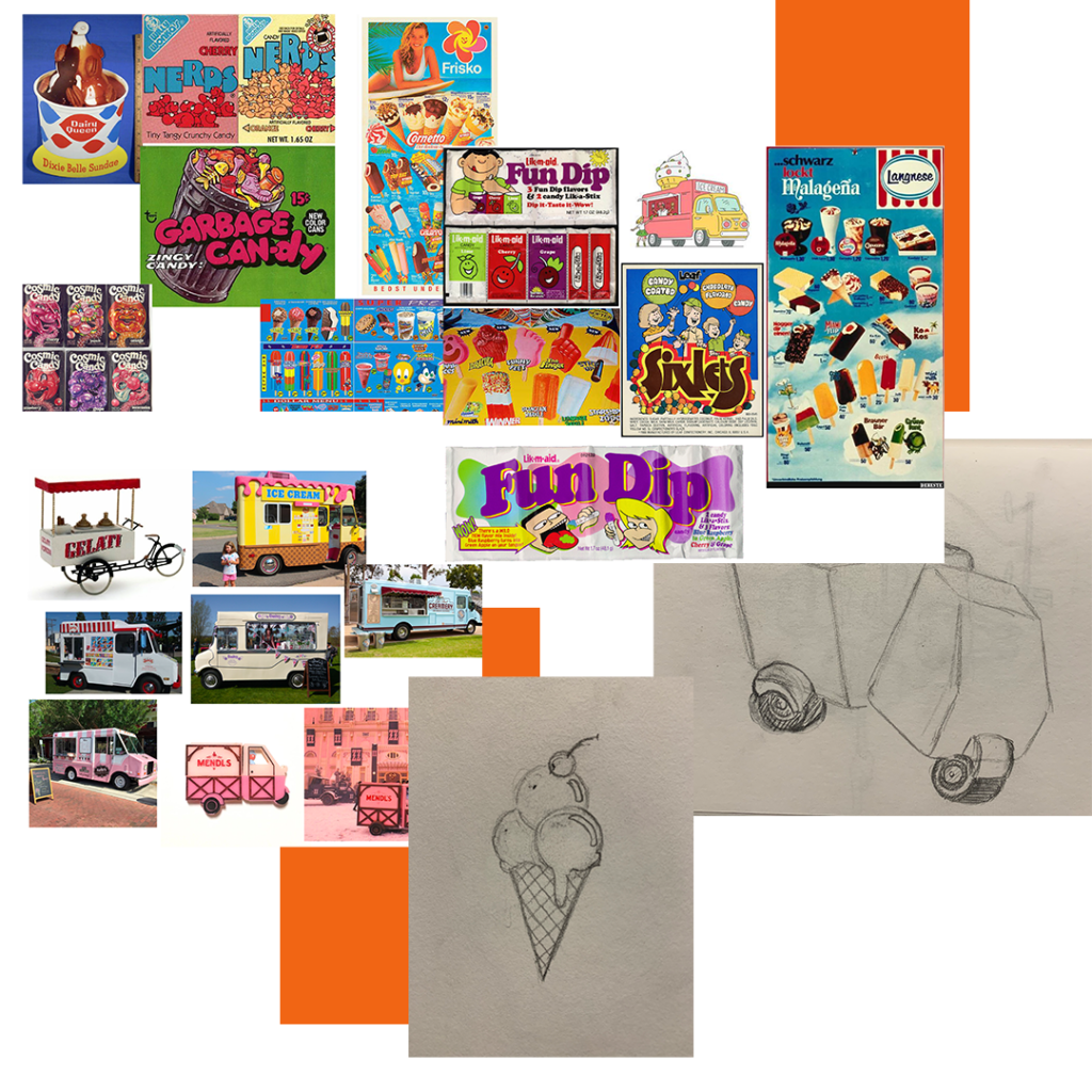
Summer of 2020 rolled around and in the midst of a heated pandemic I found solace in moodboarding old candy and ice cream advertising & packaging. Sumit had another song he deemed worthy to release. We connected yet again and he loved where my mind was thematically. “Let’s name the song ‘Gelato’ then” he said.
Going down the path of “Gelato” and now just ice cream, my sights converged on vintage, cute, and classy gelato trucks like what I’d seen in Grand Budapest Hotel. When I brought the concept of using a truck rather than the obvious ice cream cone, Sumit agreed. Early concept sketches can be seen on the bottom right.

coming into our own
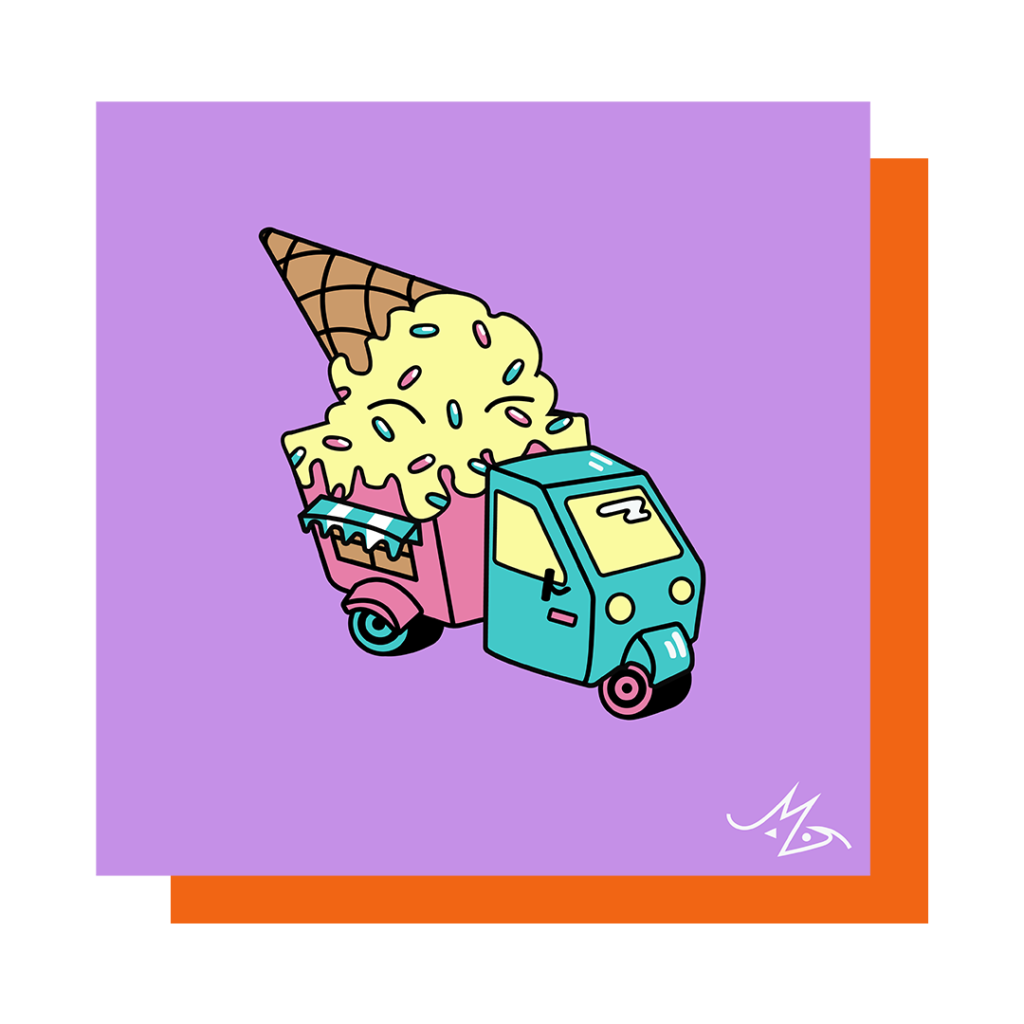
For the final Gelato artwork I wanted to bring the same composition we did for Cholula, featuring a bold cartoon centerpiece and flat background. I loved how so little could pack so much. This time around, however, I made the outlines thicker and more vectorized (giving the piece a smooth and shiny look).
It’s cool looking back through these pieces and noticing where I got better in my design technique – before college, my knowledge of digital art software was surely close to none! Here one could start noticing a pattern of art style (something that would be continued for the next commission). The Sumit Style!

building a legacy to reference
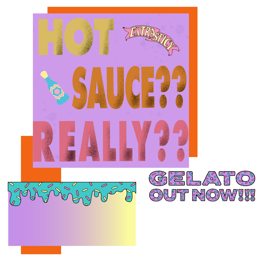
On top of completing the cover art in Illustrator, I was becoming more and more familiar with making motion graphics in After Effects. I wanted Sumit to push me in an area I wanted to grow. So, he tasked me with creating the promo and bumpers surrounding Gelato’s release too!
This was a blast because I could develop a world that the cover art lived in. It was my first taste of making visualizers. Sumit had gotten to a point where he was irreverently poking fun at his previous songs. This self-awareness helped set even more continuity in the character Sumit and I were building. In the teaser for Gelato you can see I reference assets from Cholula but break them down to reveal a new era from Sumit brandishing purple skies and a tiny trucks bearing gifts of new flavorful sound.

tequila
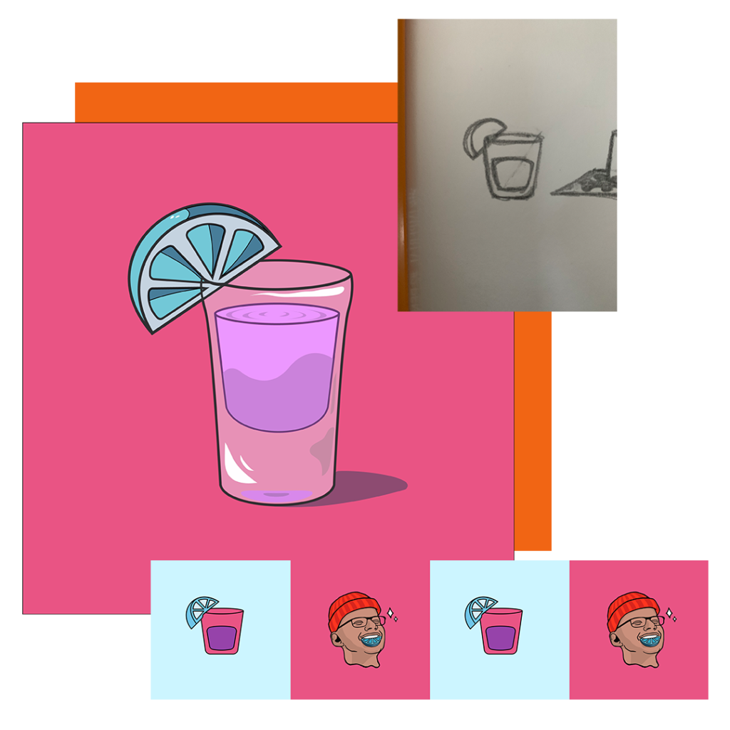
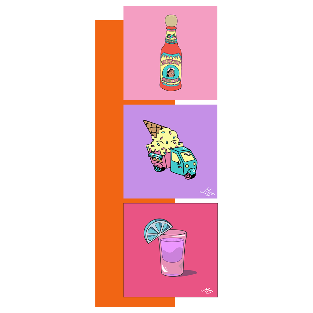
September 2020 brought me and Sumit’s fourth collaboration, his party anthem, Tequila. We felt we had something great going with the simple and literal art interpretations of the song titles. I’m expediting showcasing the process for this one because it was practically the same: moodboard, sketch with diverse thinking, select the strongest composition, draw on Illustrator, determine color scheme.
Something different I brought to the table this time around was my decision to make the alcohol purple and the lime blue. It bored me to their normal colors. I wanted the color scheme to be in line with the Sumit brand.
Like Cholula I also made simplified icon versions of the cover art and I updated Sumit’s profile face. He was bald now and rocked a red beanie all the time. For the promotional artwork towards this single I also put a lime in his mouth.

legacy in action
Now when a listener looks back over Sumit’s discography, they see a message that this artist is intentional about cohesion in his body of work. He’s committed to delivering bright vibes to the world!
I’m so glad I got to work on this trilogy of covers because Sumit and I took elements we loved and honed them into a significant stylized collection.
For the single following Tequila, Sumit wanted a different collaborator to venture into more photo-based cover art. But during our run of releases together, we brought the rapper to nearly 5k monthly listeners. To us that was a special milestone.

the warehouse
Let’s flash forward one year – I’ve been keeping busy with several freelance design and branding opportunities and Sumit’s ventured out into a new and exciting arena for his music to thrive – live shows.
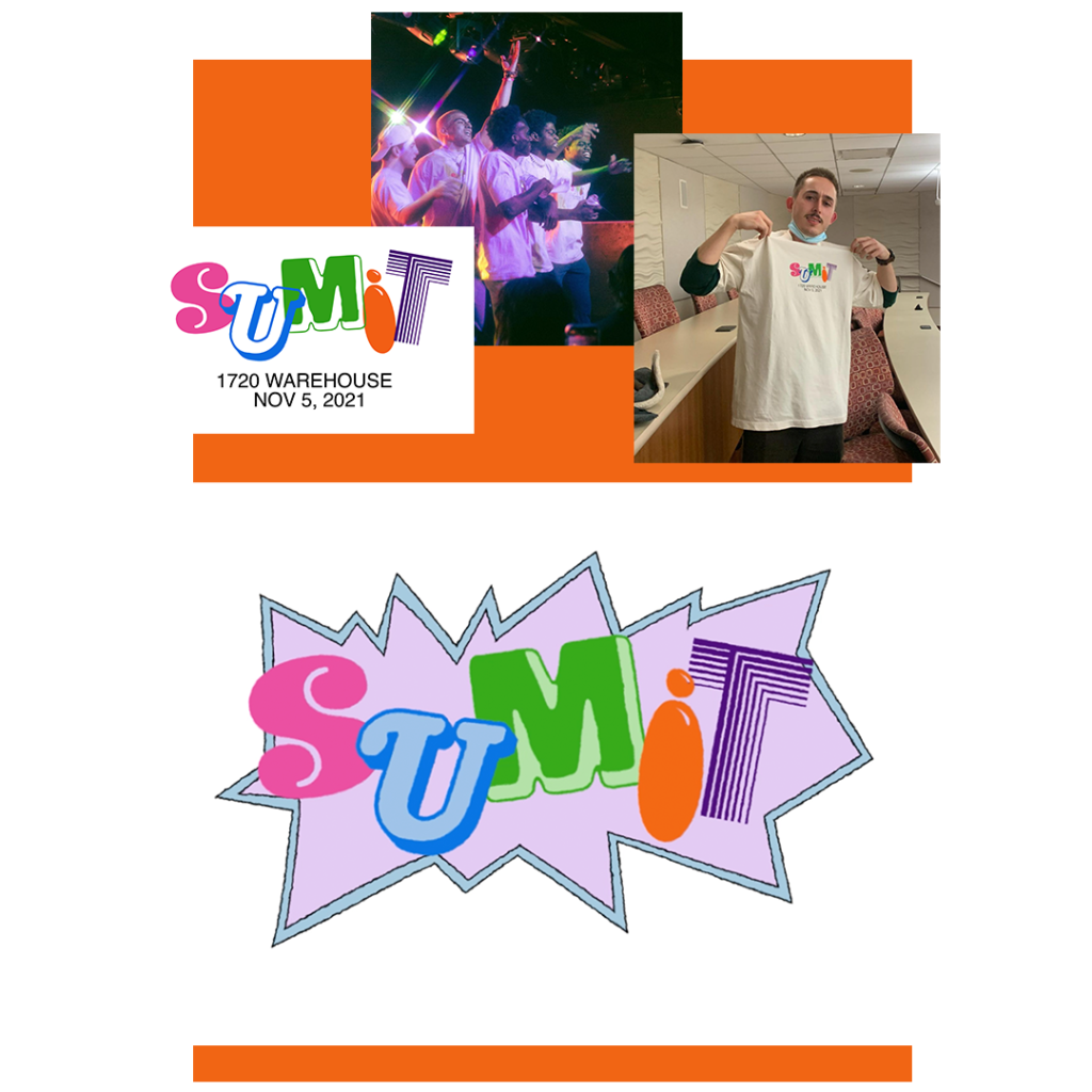
In October, 2021, Sumit reached back out to me to pich a reunion project: his largest performance yet was booked at a club venue in downtown LA and he wanted concept visuals as well as a limited run of merch to go with the big gig.
Staying true to the vibrant energy we’d established, I crafted a colorful collage of fonts akin to 80s and 90s tv (Rugrats, Klasky Csupo, Looney Tunes). The video you see here played on loop behind Sumit and his entourage (including myself) performing on stage.
We sold out of 50 tees at $40 each! The support from the fanbase we’d accrued over the years was unimaginable and I’m forever thankful that consumers continue to enjoy and spread my art!
